Unit 2: The Swiss Style

The International Typographic Style, which is also called the Swiss Style, was built up by designers from Switzerland in the middle of the 20th century.  Due to its neutrality during the second world war, the country became the meeting point for intellectuals and ideas for many different places such as Holland, Russia, Germany and England.

The movement of Swiss style began at Swiss schools. The first being Kunstgewerbeschule in Zurich. This art and design institute was led by the influential Josef Müller-Brockmann. The second school involved in the development of Swiss style graphic design was Allgemeine Gewerbeschule in Basel, which was led by Armin Hofmann.

Students at these schools were never forced to adopt a certain style but instead a respect for content through simplicity was encouraged. This became the birth of Swiss style graphic design – inspired by the modernist ideal of form following function.

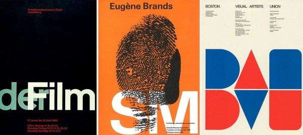
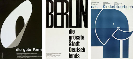
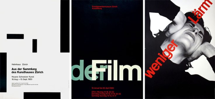
The Swiss style included works of book, poster, trademarks and advertising. Designers consciously moved away from illustration by using more photography. Swiss style emphasized on neatness, eye-friendliness, readability and objectivity. It was a shared interest among designers to communicate ideas universally and effectively. This basic knowledge of universal understanding made Swiss style earn its moniker dubbing it as the ‘International Typographic Style’.

Swiss Style
The Swiss Style – https://gt3themes.com

The Swiss styles is characterized by applying the norms on simple yet artistically and clearly deliver messages by:

  • Preserving uniformity and geometry
  • Allowing wider spacing
  • Using of grid systems
  • Structuring information
  • Keeping minimalism
  • Using sans serif fonts
  • Using different fonts sizes
  • Using of effective photography

Key figures of the movement

Max Bill (1908 – 1994)
He was a Swiss architect, artist, painter, typeface designer, industrial designer and graphic designer. He was student at Bauhaus school in Dessau. He became and important for his contribution to graphic design when Switzerland became the centre of the continuation of avant-garde ideas. He had admiration for Le Corbusier and shared the idea that designer should be prepared as architects. He became professor at the school of arts in Zurich in 1944.

Emil Ruder (1914 – 1970)
He was one of the major contributors to Swiss Style design. He taught that typography’s purpose was to communicate ideas through writing, as well as placing a heavy importance on Sans-serif typefaces. Ruder began his education in design at the age of fifteen when he took a compositor’s apprenticeship. By his late twenty’s, he began attending the Zurich School of Arts and Crafts when the principles of Bauhaus and Tschichold’s new typography were taught. He is distinguishable in the field of typography for developing a holistic approach to designing and teaching that comprised philosophy, theory and a systematic practical methodology.

car4
Emil Ruder – History of Graphic Design

Armin Hofman (b. 1920)
He taught for several years at the Basel School of Design and he was not there long before he replaced Emil Ruder as the head of the school. The Swiss International Style, and Hofmann, thought that one of the most efficient forms of communications was the poster and Hofmann spent much of his career designing posters, in particularly for the Basel Stadt Theater. His Graphic Design Manual was, and still is, a reference book for all graphic designers.

Josef Muller-Brockmann (1914 – 1996)
Joseph Müller-Brockmann was influenced by the ideas of several different design and art movements including Constructivism, De Stijl, Suprematism and the Bauhaus. Perhaps his most decisive work was done for the Zurich Town Hall as poster advertisements for its theater productions. He published several books, including The Graphic Artist and His Problems and Grid Systems in Graphic Design.
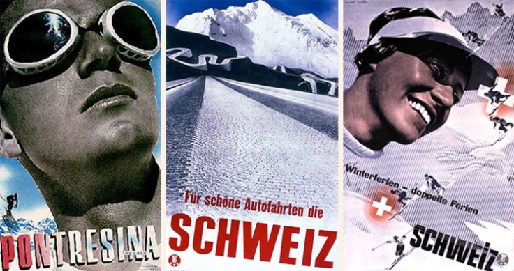
posters
Josef Muller-Brockmann – Design is History

Herbert Matter
Matter was a Swiss born American graphic designer and photographer. He was also a master of using photomontage, color and typography in an expressive manner, transcending the boundaries between art and design. His design work often favored a heavy use of photography. His most recognizable works are the posters he created for the Swiss Tourist Office.

matter01
Herbert Matter – Design is History

Max Huber (1919 – 1992)
He was a swiss graphic designer, artist and educator well known for his innovative and edgy approach to design. His career begins in 1935 in Zurich where he works for an advertising agency. With the beginning of the World War II – in order to avoid being drafted in the Swiss army – he moves to Milan to join the Studio Boggeri. But Italy enters the war in 1941 and Huber is forced back to Switzerland where he begins a collaboration with Werner Bischof and Emil Schultness for the influential art magazine Du.

Wolfgard Weingart (b. 1941)
He was tyesetter but became a graphic designer and typographer. He was teacher a the Basel School of Design in 1963. Even though his work come from the Swiss typographic traditional he launched a new style known as “new wave” or punk. This consisted in deconstruction of type and the rearrangement of elements in new compositions.

Swiss Typography

Akzidenz-Grotesk
Is a grotesque typeface originally released by the Berthold Type Foundry in 1896 under the name Accidenz-Grotesk. It was the first sans serif typeface to be widely usedand influenced many later neo-grotesque typefaces after 1950.

Futura
Paul Renner was a typeface designer. In 1927, he designed the Futura typeface, which became one of the most successful and most-used types of the 20th century.

Helvetica
Helvetica was developed in 1957 by Max Miedinger with Eduard Hoffmann at the Haas’sche Schriftgiesserei (Haas Type Foundry) of Münchenstein, Switzerland. Haas set out to design a new sans-serif typeface that could compete with the successful Akzidenz Grotesk in the Swiss market. Originally called Neue Haas Grotesk, its design was based on Schelter-Grotesk and Haas’ Normal Grotesk. The aim of the new design was to create a neutral typeface that had great clarity, no intrinsic meaning in its form, and could be used on a wide variety of signage.

h4
Helvetica

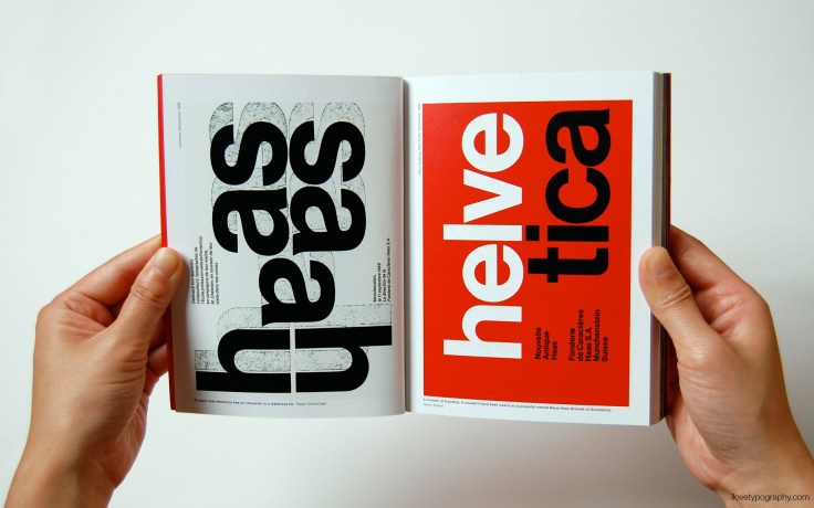
In 1960, the typeface’s name was changed by Haas’ German parent company Stempel to Helvetica (meaning Swiss in Latin) in order to make it more marketable internationally.

Univers Type Family
In 1954, Adrian Frutiger, Deberny & Peignot foundry’s art director, suggested to create a new font that would be suitable for the typesetting of longer texts. Univers type family was born 1957. It is considered to be unique because it became one of the first typefaces produced for use with phototypesetting systems.

International Typography Style
Swiss style began to internationalize thanks to official graduate programs promoted between the Design School at Yale and that of the school of Applied Arts in Basel. Student took part in exchange programmes and the American students carried their knowledge back to the States. In addition to this, another important element that spread the style was the distribution of publication like “Neue Grafik“.
European graphic designers worked in American companies and vice-versa. All these elements contribute to increase the interest in the Swiss style internationally.

International Style and Corporate Identity

In the 1950s the was over. This was the era of a huge corporate growth. At the end of the was the troops were back home, and everyone wanted a family, a house and a car. Corporate in the US were doing there best to meet these needs.

Paul Rand (1914 – 1996)
He was an American Graphic designer, lecturer and art director. He was one of the first American designers to take inspiration from Swiss Style design. He was also influenced by the avant-garde movements such as Constuctivism, De Stijl and Bauhaus.

NeXT-IBM-Logo-Paul-Rand
Paul Rand – Corporate Logs (Next – IBM)

He is very well known for his contribution to graphic design thanks to the corporate identities such as IBM, ABC, Cummins Engine, Westinghous, UPS. Rand’s defining corporate identity was his IBM logo in 1956.

Saul Bass
He was a graphic designer, film maker and illustrator, very well known for his companies logo but in particular for his creative collaboration with Alfred Hitchock and other Hollywood directors that made him a household name.

screen-shot-2017-08-09-at-11-44-14-am
Saul Bass – Movie Posters

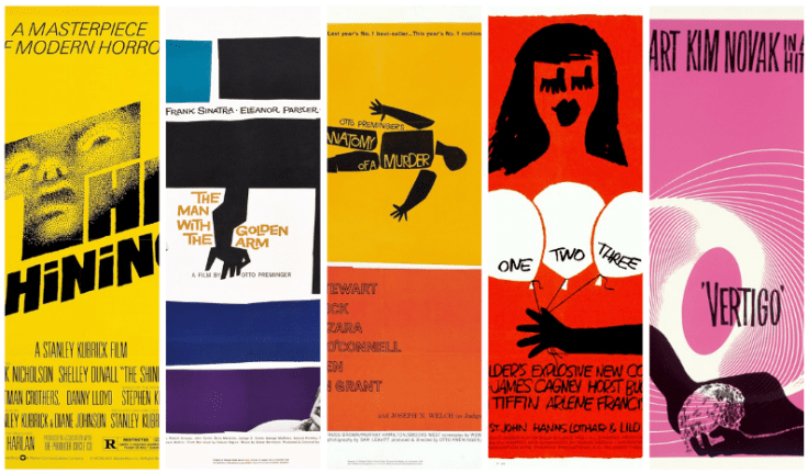
He revolutionized the way that people viewed movie titles by using the time to not just display the information but give a short visual metaphor or story that intrigued the viewer. Often times it was a synopsis or reference to the movie itself. His list of title credits include famous films such as West Side Story, Psycho, Goodfellas, Big, North by Northwest and Spartacus. He created four titles for Martin Scorsese, the last of which was for Casino.

Push Pin Studios

Push Pin Studios is a graphic design and illustration studio formed in New York City in 1954. Cooper Union graduates Milton Glaser, Seymour Chwast, Reynold Ruffins, and Edward Sorel founded the studio.
Push Pin look has nothing in common with the Swiss Style, it was often remixed with historical styles, in particular Art Nouveau, Victorian Typography and wood type. Push Pin work was characterized by very strong political statements against racial issue as well as humour.

Key figures

Milton Glaser
He is an American graphic designer and founding member of the Push Pin Studio in 1953. He is very well known for his pro bono work the “I Love New York” logo and Bob Dylan poster.

Seymour Chwast
He was a graphic designer and a founding member of Push Pin studios with Miton Glaser and Ed Sorel. He has a very wide range of styles and diverse of work.

Jacqueline Casey
She was an American graphic designer mostly known for her International style work for MIT.

Alvin Lustig
He had a varied design background, known for his contribution to book cover design and also as an interior and architectural designer. He is known for his geometric shapes, flat colours and patterns.

Elaine Lustig Cohen
Alvin Lustig’s wife, she is a graphic designer, fine art painter his style was influenced by European Avant garde. Her work is characterized by abstract elements incorporated with typographic elements.

Massimo Vignelli
He studied Architecture in Italy and moved to New York. His first major foray into the field of identity and branding was through Unimark International, which quickly became one of the largest design studios in the world.

Massimo-Vignelli-Subway-Graphic-Design
Massimo Vignelli – New York City Subway map

He has designed identities for international corporations including American Airlines (which is the only airline to have not changed their identity in the past 50 years), Bloomingdales and Knoll. He favors a clarity in design and is a huge fan of using Helvetica, which can be seen in much of his work.

Reference

Design is History

History of Graphic Design

Swiss Style in motion animation

Visual Hierarchy

What is Swiss Style Typography?

Unit 2: Bauhaus Movement

The Bauhaus movement takes its name from a German institution, named the Bauhaus, founded in Weimar (Germany) by Walter Gropius in 1919. The idea behind this school was to create a “total art work” where all the arts could be unified together. The Bauhaus style later became one of the most influential currents in modern design, Modernist architecture and art, design, and architectural education.
The school existed in three German cities—Weimar, from 1919 to 1925; Dessau, from 1925 to 1932; and Berlin, from 1932 to 1933—under three different architect-directors: Walter Gropius from 1919 to 1928; Hannes Meyer from 1928 to 1930; and Ludwig Mies van der Rohe from 1930 until 1933, when the school was closed by its own leadership under pressure from the Nazi regime, having been painted as a centre of communist intellectualism. Although the school was closed, the staff continued to spread its idealistic precepts as they left Germany and emigrated all over the world.

The Bauhaus Style
The movement was influenced by the modernism. Modernist artists sought to strip their arts of all ornamentation and reduce them to the simplest.In essence, they sought to restore the purity of art by removing everything unnecessary and leaving only the line, shape and colour. The Bauhaus movement came to define a type of Modernism known as the International Style. Simplistic in design, International art and architecture stressed functionality over everything else, and sought to challenge the way buildings, art, and even decorative objects like chairs could be used. They tended to be geometric, plainly colored or white, and useful/functional. The basic idea of this movement was the fact that they believed that art could be beautiful without ceasing to be useful. Decorative crafts, utilized as furniture or textiles in a home, were a big part of this.

Main exponents of the Bauhaus

Johannes Itten he used to teach the “preliminary course” of basics of material characteristics, composition and colour. He is known for his contribution in furthering the studies of the colour wheel that we know today. He was a follower of a fire cult originating in the US derived from the Zoroastrianism. He was very spiritual person, meditation was his main source of inspiration and practice. He used to associate colours with emotions on the basis of the temperature.

Paul Klee was a Swiss German musician and artist. He was a memeber of the “Blue Rider” that was group of artists working in abstract expressionism. He used mystical hieroglyphs forms and unconventional looking creature in his work. He was master at Bauhaus and taught bookbinding, painting and stained glass production.

Wassily Kandinsky was born in Moscow, Russia. He studied economics and law at the University of Moscow. Kandinsky always enjoyed music and painting since his childhood. A turning point in his life towards art is due to a performance of Richard Wagner’s opera, Lohengrin, where he experienced synesthesia. After leaving law he moved to Germany and attended art school at Munich. For Kandinsky, art was a spiritual and emotional experience. He wanted his painting to transcend recognized forms and express feelings through colours and shapes. He also argued that artistic experiences were all about feeling, and colours affected mood. One of his work was included in the famous 1913 New York Armory Show that introduced Americans to the European modern art movement.

Lyonel Feininger was a German American painter, caricaturist and comic strip artist. He was the first person to get the job at the Bauhaus school and he designed Bauhaus Manifesto “Cathedral” in 1919.

Laszlo Moholy-Nagy was a Hungarian painter, photographer and professor in the Bauhaus school. He experimented with photomontage and typography, he stated that the ladder is a “tool of communication” and emphasized that the type must be clear, legible and communicate the message. He succeeded in creating an asymmetrical typography. His passion for typography and photomontage inspired a Bauhaus interest in visual communication.

Hannes Meyer was director of Bauhaus after Gropius was forced to resigned from the School. He was hired to set up the architectural program in the school. Meyer had communist ideal and growth of communist student organization in the Bauhaus became a threat to the existence of the period in that period.

Joseph Albers was a German born American artist and educator who worked in Europe and United States. He was enrolled as a student at Bauhaus 1923, Gropius asked him to teach preliminary course on handcrafting due to his experience in the field. Very well known for creating furniture, such as chairs. At the Bauhaus he created a new typeface called “Kombinationshrift”, that used 10 basic geometrical shapes to create letters and numbers.

Anni Albers she is known for her integration of abstract modernism into textile weavings. She was married to Joseph Albers and together they moved to the United States when Nazi party threatened the Bauhaus.

Marianne Brandt known for her metal work, but she worked privately on photomontage and avant garde collage composition at the Bauhaus, these were kept hidden until 1970s.

Herbert Bayer, was a student at Bauhaus and after passing his final examination he was appointed by Gropius direct the printing & advertising workshop to open the Dessau location. In 1925 he was asked by Gropius to design a typeface for all Bauhaus communication. During this occasion he created the “universal” typeface a simple geometric sans serif font. He believed that a typeface needed to be functional, able to communicate so there was no need to add serif and upper case letters.

Jan Tschichold was greatly influenced by the Bauhaus approach to typography. He is most noted for his manifesto “The New Typography” in which he condemned all the typefaces except sans-serif. He rejected decoration in favour of a more rational design planned for communicative function. His design were stripped of unnecessary elements and typeface was reduced to its basic elementary shapes. In 1933 Tschichold and her wife were arrested by the Nazis, since he was accused for creating an “un-German” typography. After this event his family and him fled to Basel where he worked as a Book designer. He began to turn his back on the “New Typography” and started using roman, Egyptian and script styles in his design. Since he felt the “New Typography” was the reaction to the chaos and anarchy in Germany and that it couldn’t develop any further.

Women at Bauhaus
While women were allowed into the German school—and its manifesto stated that it welcomed “any person of good repute, without regard to age or sex”—a strong gender bias still informed its structure. Female students, for instance, were encouraged to pursue weaving rather than male-dominated mediums like painting, carving, and architecture. Bauhaus founder Walter Gropius encouraged this distinction through his vocal belief that men thought in three dimensions, while women could only handle two.

Arndt’s ambition was to become an architect, but it was only after she landed at the Bauhaus in 1923 that she realized architecture classes were not yet available at the school. She ended up crafting geometrically patterned rugs in the weaving workshop. As a self-taught photographer, Arndt began by shooting the buildings and urban landscapes around her. She also assisted her husband’s architecture firm by photographing their construction sites and buildings.

Stölzl was one of the earliest Bauhaus members, arriving at the school in 1919 at the age of 22. The same year, she penned confident diary entries that would foreshadow her success as a leading designer of the era. “Nothing hinders me in my outward life, I can shape it as I will,” one reads. “A new beginning. A new life begins,” goes another. While she experimented with a diverse range of disciplines at the Bauhaus, Stölzl focused on weaving, a department that she helmed from 1926 to 1931. There, she was known for complex patchworks of patterns, composed of undulating lines that melt into kaleidoscopic mosaics of colored squares. They took the form of rugs, wall tapestries, and coverings for Marcel Breuer’s chairs.

BAUHAUS IMPACT TODAY

Bauhaus has celebrated 100 years this year and its style principles are still applied in many works today as well. If we think of IKEA, that is one of the perfect example of the Bauhaus principle application: mass production and functional furniture. It was part of the Bauhaus philosophy that modern design should harness industrial techniques to make products accessible to everyone.

1910
Ikea Gunde folding chair

Bauhaus has revolutionized the way many architects conceptualize their work, using function as a main factor that drives the designing of their buildings.

1247067_AJ10__c_NickKane7
Alzheimer’s Respite Centre, Dublin

An example of Bauhaus architect can be found in Dublin: “Alzheimer’s Respite Centre” built with shorter corridors and large windows for easier way-finding.

References

Alzheimer’s Respite Centre, Dublin, by Niall McLaughlin Architects

Design is History

History of Graphic Design

The Local – How Bauhaus designed the world as we know it

The Guardian – Bauhaus at 100: its legacy in five key designs

Artsy – The Woman of the Bauhaus School

Unit 2: Russian Constructivism – De Stijl

The 20th century is characterized by the birth of multiple modern art movements such as: Avant Garde, De Stijl, DaDa in Europe and Constructivism in Russia.

Most or the artists and designers of this period start taking their distance from the traditional forms of art and embrace new modes of thinking, creating and living. They share this common rejection for war and European and american capitalism. They reject the representational art, the art that is purely for aesthetic pleasure. They believe in the creation of a new original visual language.

Avant Garde
The most influential artists of the this movement are Pablo Picasso and Gerog Braque. Pablo Picasso’s painting Les Madmoiselle D’Avignon represents a turning point from traditional composition and perspective of painting. Figurative painting composed of flat, fractured planes and faces inspired by the african masks.

De Stijl
The Stijl, known also as neoplasticism, is a dutch movement founded by Piet Mondrian and Theo Van Deosbourg in 1917 in the Netherlands. The aim of the movement was to create a universal style in architecture, paintings and design. Functionalism and simplicity are the main elements of this movement, characterized by the use geometric shapes, straight lines, primary colours with use of black, white and grey only, use of positive and negative spaces.

DaDa
Dada or Dadaism it is european avant-garde movement that started in the 20th century. Developed in reaction to World War I, the Dada movement consisted of artists who rejected the logic, reason, and aestheticism of modern capitalist society, instead expressing nonsense, irrationality, and anti-bourgeois protest in their works. (wikipedia) The explosion of photographic images in the mass media in the year of the wars, stimulated artist’s experimentation with montage and collage.
The main exponents of the this movement are Kurt Schwitters famous for is collages and known also as the father of collage.
Raoul Hausmann was the founding member of the Dada movement in Berlin. He was one of the pioneers of photomontage and use this as tool for political protest.
Hanna Hoch was a German Dada artist, famous for her photomontage and through her work she touched issues related to gender, politics and androgyny.
John Heartfield famous for his photomontage, he cut and pasted together parts of different photographs to recreate new compositions, often satirizing Hitler and Nazy party.

Constructivism
Constructivism starts in Russia around 1913, by a group of artists and architects influenced by cubism. It conjoins together different fields of painting, sculpture and kinetics with machine production, architecture and applied arts. It is movement that put the art to work in the service of the nation. In 1920, the movement writes its first “Realist Manifesto” in which outlines the goals of the movement (one of which was “construct art”) they show their enthusiasm for machines, technology, industrialism and modern industrial material. They do not believe the abstract ideas, they try to link art with concrete and tangible ideas. Stylistically speaking the movement is characterized by use of:

  • geometrical elements;
  • typography, they use san serif typefaces in their work;
  • flat, symbolic colours (red, black etc..)
  • white spaces;
  • Photography and photomontage.

The most influential artists of this movement were:

El Lissitizky, Alexander Rodchenko, Varvara Stepanova, Gustav Kutisis,Valentina Kulagina and Stenberg Brothers.

El Lissitzkey most of the innovative artists among the constructivists. He worked using different media painting, graphic design, photography and architecture.
Alexander Rodchenko believed in the introduction of art in everyday life. As Lissitzky he worked in different media such as painting, sculpture, graphic design, photography and montage.
Varvara Stepanova she was a Russian avant-garde artist, painter, photographer and designer, dedicating large part of her life to affecting social change (she created posters, set design, costume and books). She uses her art with the purpose of making the change in the society.
Gustav Klutsis, was an art teacher, photographer and graphic artist. He is considered to be one of the pioneers of the photomontage. He worked for Stalin with her wife Valentina Kulagina whose work is characterized by a mixture of techniques that goes from lytography, photomontage, typography and painting.
Stenberg Brothers are famous for their movie posters for the Russian cinema, they developed a special hand technique to increase the image poster size since the mechanical engagement was not available in that period. They used contrasting colours and unusual colours to create a dramatic impact.

Contemporary
Jim Fitzpatrick, is an Irish artist that is mostly known for his Celtic illustrations and Thin Lizzy work.
Shepard Fairey, is a graphic designer, illustrator, street artist and activist.

CONSTRUCTIVISM TODAY

One legacy is the popularity of the Constructivist style, which was reinvented by Saul Bass’s in 1950s titles for “Vertigo,” “Psycho” and other Alfred Hitchcock movies to Barney Bubbles’s 1970s artwork for Stiff Records and the current Saks campaign.

Russian constructivism propaganda posters have influenced and inspired the work of many of today’s Graphic designers. I found some examples of poster where the influence of the style can clearly be seen. The poster for CBS Recordas by Paula Scher (1938).

sample05
CBS Records (1979) – Paula Scher

Say Yes!(2008) Shepard Fairey – inspired by a song of the same name by a band called the Afternoons. This poster was seen on the streets of LA shortly after the Obama posters.

Advert02
Say Yes! (2008) – Shepard Fairey

References

The Art Story – Constructivism

The Design History – Constructivism

NY Times – The enduring legacy of Soviet Constructionism

CSUN – Russia Constructivism

Unit 2: Contextual Studies

Industrial revolution (1760s – 1840s)
This period is characterized with a huge innovation in Europe and U.S. in multiple sectors. The invention of the steam engine brought huge innovation in transportation and factories (since there was no more need for these to be built on rivers). In addition to the this the invention of steel brought change in the urban architecture as well since buildings could be made much more taller. The boom in the steel industry led to the invention of the car.
The industrial revolution brought innovation in textiles and glass sector. Especially the invention in the sheet glass led to architecture creation such as the Crystal palace designed by Joseph Paxton to house the Great exhibition of 1851.
Together with innovation industrialization brought downsides effects as well such as pollution, that led to disease such as lung cancer, child labour and a huge social economical difference between the owners of the factories and worker.

During this period of change graphic communication became more and more important, such as:

  • colour lytography
  • typography

One of the major exponents in typographic innovation is William Caslon with the “W Caslon Jun Letter Founder” a sans serif typeface inspired by egyptian style. Wood type and pantograph took place as well, this last combined with the router led to the invention of the new wood type font.
There was more and more spreading of poster that were used to sponsor different clients such as travelling circus and theatrical groups, clothing stores. In order to make hand press stronger and efficient several improvements were thought such as the steam-powered printing press. This was invented by a German printer, Friedrich Koenig.
In 1815 William Cowper obtained the patent for a printing press using curved stereotyped plates wrapped a cylinder that could produce 2400 impressions per hour.
Linotype took leap around 1886 that was created to reduce compositer’s work time. The rapid development of lynotype caused unemployment for thousands of highly skilled hand-typesetters. However the new technology brought an explosion in the graphic design sector that came along with a high number of jobs as well. With the invention of lynotype book publishing expanded rapidly.
Photography took the leap as well during this period, photos used for different purposes such as photojournalism. The development of motion-picture photography became important as well.

The Victorian Era (1837 – 1901)
This refers to the period of the reign of Queen Victoria. Innovation of industrial revolution brought innovation in arts and industry.
Art of this period is characterized by an aesthetic confusion, gothic influence and eclectic mix.Artists conveyed the values of the era such as nostalgia, romanticism, and principle of an idealized beauty expressed through printed images of children, puppies, maiden and flowers, objects that are ornamented heavily.

The main exponents of the Victorian were:
Walter Crane, famous for his didactic and moral purpose images.
Randolph Caldecott, in his work he tend to personified dishes and plates.
Kate Greenaway she was a book designer and cloth designer.

There is born of Editorial and advertising as well, Harper and Brothers had become the largest printing and publishing firm in the world. They opened the era of pictorial magazine in 1850.
Victorian typography presented the following characteristics:

  • Ornate in letterforms;
  • Gothic influence, calligraphic approach;
  • Extreme variations of tpe size and weight;
  • design and content fill the whole page.

Arts & Crafts Movement
This movement began in England in 1860 and characterized with the focus on the quality of the materials; appreciation for old methods of production; natural materials. The style of this movement is often described as “honest” in terms of expression of function, materials and techniques of production.

The main exponents of Arts & Crafts Movement
John Ruskin (1819-1900) was an English critic of art, architecture.
William Morris (1834 – 1896) designer that focused on the design for textiles, wallpapers, book and typography. He took his inspiration from the nature. His designs were charaterized by simplicity, refreshing and decorative. He felt that the study of the nature was important to produce good design.
Kelmscott Press famous for his stylish bookworks.
Philip Webb (1831 – 1915) interested in architecture and interiors.
Charles Rennie Mackintosh (1868-1928) his art designs incorporated elements both from Art & Crafts movement as well as Art Nouveau. He is widely known for furniture designs. He is also very well known for his distinct lettering.
Eric Gill (1882 – 1940) he is very well known for his typeface Gill Sans and Perpetua.

Art Nouveau
The period of innovation and prosperity in the 19th century brought the upper middle class to support new and experimental direction in designs. France and Belgium became the leading region in the development of art Nouveau (1890 – 1910). Art Nouveau is based on:

  • rejection of Victorian styles;
  • rejection of historical imitations;
  • fine art;
  • Nature as main inspiration;
  • curvilinear forms

The Art Nouveau spread in different fields – architecture, furniture and product design, fashion and graphics. Art Nouveau graphic designers try to attempt to make art a part of everyday life.

The main exponents of this period are:
Eugene Grasset (1845 – 1917) swiss artist and designer considered to be one of the pioneers of the Art Nouveau. He is famous for is posters, postcards and logos and worked in different fields such as jewellery, sculpture, painting and furniture designing. He was influenced by Japanese art as well.
Aubrey Beardsley (1872 – 1898) was a controversial and prolific illustrator, with sexual concepts described as grotesque, elegant and decadent.
Henri de Toulouse-Lautrec, inspired by Japanese art and impressionism, he has a journalistic illustrative style that captured the night life of belle epoque.
Alphonse Mucha (1860 – 1939) Czech artist and designer.
Will Bradley (1868 – 1962) famous for his poster style in the U.S.

Blog at WordPress.com.

Up ↑

Design a site like this with WordPress.com
Get started